Fill in the Gene and Tissue values and click the (RE)Draw Plot! button.
It may take a few seconds for the plot and table to appear.
Fill in the Gene and Tissue values and click the (RE)Draw Plot! button.
It may take a few seconds for the plot to appear.
Select a first and second PCA component then click the (RE)Draw PCA Plot! button.
It may take a few seconds for the plot to appear.
Select a first and second PCA component then click the (RE)Draw PCA Plot! button.
It may take a few seconds for the plot to appear.
References
Bulk Tissue Gene (or transcript(tx)) Raw Count Matrices
Rows are genes, columns are samples, values are
raw counts as calculated by salmon.
Metadata
Codebase
Missing anything?
If there's some data you want for easy download,
let me know
eyeIntegration v2.12

Mission
The human eye has several specialized tissues which direct, capture, and pre-process information to provide vision.
RNA-seq gene expression analyses have been used extensively, for example, to profile specific eye tissues and in large consortium studies, like the GTEx project,
to study tissue-specific gene expression patterning.
However, there has not been an integrated study of multiple eye tissues expression patterning with other human body tissues.
We have collated publicly available (deposited between January 1st, 2019 and November 1st, 2023) healthy human RNA-seq datasets and a substantial subset of the GTEx project RNA-seq datasets and processed all of these samples in a consistent bioinformatic workflow. We use this fully integrated dataset to build informative visualizations, a novel PCA tool, and UCSC genome browser to provide the ophthalmic community with a powerful and quick means to formulate and test hypotheses on human gene and transcript expression.
 We make these data, analyses, and visualizations available here with a powerful interactive web application.
However, there has not been an integrated study of multiple eye tissues expression patterning with other human body tissues.
We have collated publicly available (deposited between January 1st, 2019 and November 1st, 2023) healthy human RNA-seq datasets and a substantial subset of the GTEx project RNA-seq datasets and processed all of these samples in a consistent bioinformatic workflow. We use this fully integrated dataset to build informative visualizations, a novel PCA tool, and UCSC genome browser to provide the ophthalmic community with a powerful and quick means to formulate and test hypotheses on human gene and transcript expression.
Ocular Samples
Attribution
This project was conceived and implemented by
David McGaughey
in
OGVFB
/
NEI
/
NIH
,
in 2017. The retina and RPE gene networks along with their accompanying web pages were constructed by
John Bryan
.
The 2019 automated pipeline datasets were built by Vinay Swamy .
The 2023 update with the PCA analysis tool, its accompanying web page, and the tissue / sample level UCSC genome browser were built by Prashit Parikh . The new metadata curation schema along with the new samples is thanks to collaborative work with Jason Miller and Lev Prasov .
Our analysis of the 2017 data in eyeIntegration has been published in Human Molecular Genetics. The manuscript is available here . If you use this resource in your research we would appreciate a citation.
We also strongly encourage citation of the publications behind the datasets used in this resource. A full list can be found here .
Source Code
The source code and data for this web application are available
here
.
Problems?
First check the FAQ by clicking on
Information
in the above header, then on
FAQs
.
Other issues can be reported two ways: Email or GitHub Issue Tracker
Other issues can be reported two ways: Email or GitHub Issue Tracker
Advanced Analysis
All links are external. Here we present a tutorial on how to use the data in EiaD
and recount3 to do custom differential testing. We also provide some brief guidance on how to use your own private data
to run custom diff testing.
2023-09-02 | v2.12
URL updates for data downloads, added new guides to Analysis and Extension
2023-09-02 | v2.11
Add two studies from Bharti and Stambolian
2023-08-31 | v2.10
Update PCA visualization with projection based approach, add sample count table, a new analysis guide. Count table updated with our own gencode based reference to expand quantified transcripts. ML based sex predictor labels added. Simplified PCA visualization options. Fixed bug in 2023 axis flip option.
2023-05-22 | v2.01
Swap out the recount3-based quant to a "vanilla" salmon quant. Has little effect on the data, but enables more straightforward outside comparison and brings back transcript level quant.
2023-04-19 | v2.00
Version 2.0! We introduce another huge set of updates, including a new 2023 dataset with 287 new eye samples, three new tissue categories, cell type level expression data, bulk RNA-seq expression boxplots to better express our new metadata, a new PCA tool with user-inputted data compatibility, and a UCSC genome browser for visualization of base-pair level expression counts. Click
here
to view the tissue-level genome browser and
here
for the sample-level genome browser.
2020-02-14 | v1.05
Updated DNTx to v01. Removed v00 as we have made SUBSTANTIAL improvements to the precision and reliability of the results. We do not recommend v00 be used.
2020-01-31 | v1.04
Add raw counts to data download, as there were a handful of requests from users. Also fix data repo link from gitlab to github.
2019-06-09 | v1.04
Big update, which addresses (I hope) the comments from the reviewers of IOVS. More GTEx samples added per tissue. New GTEx tissues added (bladder, bone marrow, cervix uteri, fallopian tube, ovary, prostrate, testis, uterus, and vagina). Ratnapriya et al. AMD (MGS 1 == normal, 2,3,4 are increasing severity of AMD) retina dataset added. Modified lengthScaledTPM scores to adjust for tissue design and use mapping rate as covariate with limma's batchEffects() function. The differential expression test now uses mapping rate as covariate. On the UI side, now using fixed (consistent) color scheme for tissue in the box plots. Update summary stats on loading page with new tissues, numbers. Also showing GTEx count differences from 2017 to 2019.
2019-04-26 | v1.03
Added prototype ocular
de novo
transcriptomes Vinay Swamy has built as a database option the pan-tissue visualizations and the data tables. We also make the
de novo
gene models (GTF) and sequence (fasta) available for download in the Data -> Data Download section. Again, this is version 00 prototype data and
will
change in the future. Depending on how much the project develops, we will expand eyeIntegration to show more information on the
de novo
transcript models or move parts of this project out into a new web site.
2019-03-06 | v1.02
Tweaked Retina Stem Cell / Organoid samples labelling. Added temporal heatmap for retina fetal and organoid time points. Modified bulk RNA-seq heatmap to use ComplexHeatmap, which handles long column names better. Optional row and clustering for the heatmaps.
2019-01-16 | v1.01
Fixed some tissue mislabels in EiaD 2019, removed unused sub-tissue, added eye sub-tissue vs human body tissue differential tests and GO term enrichments. Updated the workflow and 2017 to 2019 tables on the main loading page.
2019-01-16 | v1.00
Version 1.0! We introduce a huge set of updates, including a new 2019 dataset with 224 new eye samples, four new eye tissue categories, non-protein coding quantification, heatmap visualization, custom user shortcuts, quick gene information links, and easy data downloads. We will soon have a bioRxiv preprint describing the new automated pipeline that underlies the 2019 dataset. For users wanting to compare previous work done on eyeIntegration, the 2017 dataset is available as a versioned option.
2018-10-12 | v0.73
Now using heatmaps for SC RNA-seq data.
2018-10-04 | v0.72
Engineering changes to make the site more responsive.
2018-09-28 | v0.70
Major changes! Can now select transcript level gene expression and Clark et al. biorXiv 2018 mouse retina time series scRNA-seq data added!
2018-08-21 | v0.63
Updated manuscript link to Human Molecular Genetics advance print and tweaked boxplot plotting size logic
2018-01-09 | v0.62
Table data added for single cell data
2017-11-09 | v0.61
More granular single cell plots and tables in the Gene Expression section
2017-09-29 | v0.60
Mouse retina single cell data now available in the Gene Expression and 2D Clustering sections! Also the Pan-Tissue Expression section now has metadata for each sample point on mouseover!
2017-05-23 | v0.51
Now the user can export data from any table
2017-05-17 | v0.5
SQLite used on the backend for the largest data files to reduce initialization time and memory usage. FAQ section added
2017-04-13 | v0.4
Added full network edge tables for retina and RPE
2017-04-08 | v0.3
Network visualizations changed (gene names are nodes, layouts cleaned up a little), boxplot re-plot button more visible, on load now defaults to the info | overview page
See our publication:
https://academic.oup.com/hmg/advance-article/doi/10.1093/hmg/ddy239/5042913

We will soon have a pre-print describing the new 2019 automated data analysis workflow. The code-base for the build can be found
here.

We will soon have a pre-print describing the new 2023 automated data analysis workflow. The code-base for the build can be found
here.
We will upload a finalized 2023 data workflow soon.
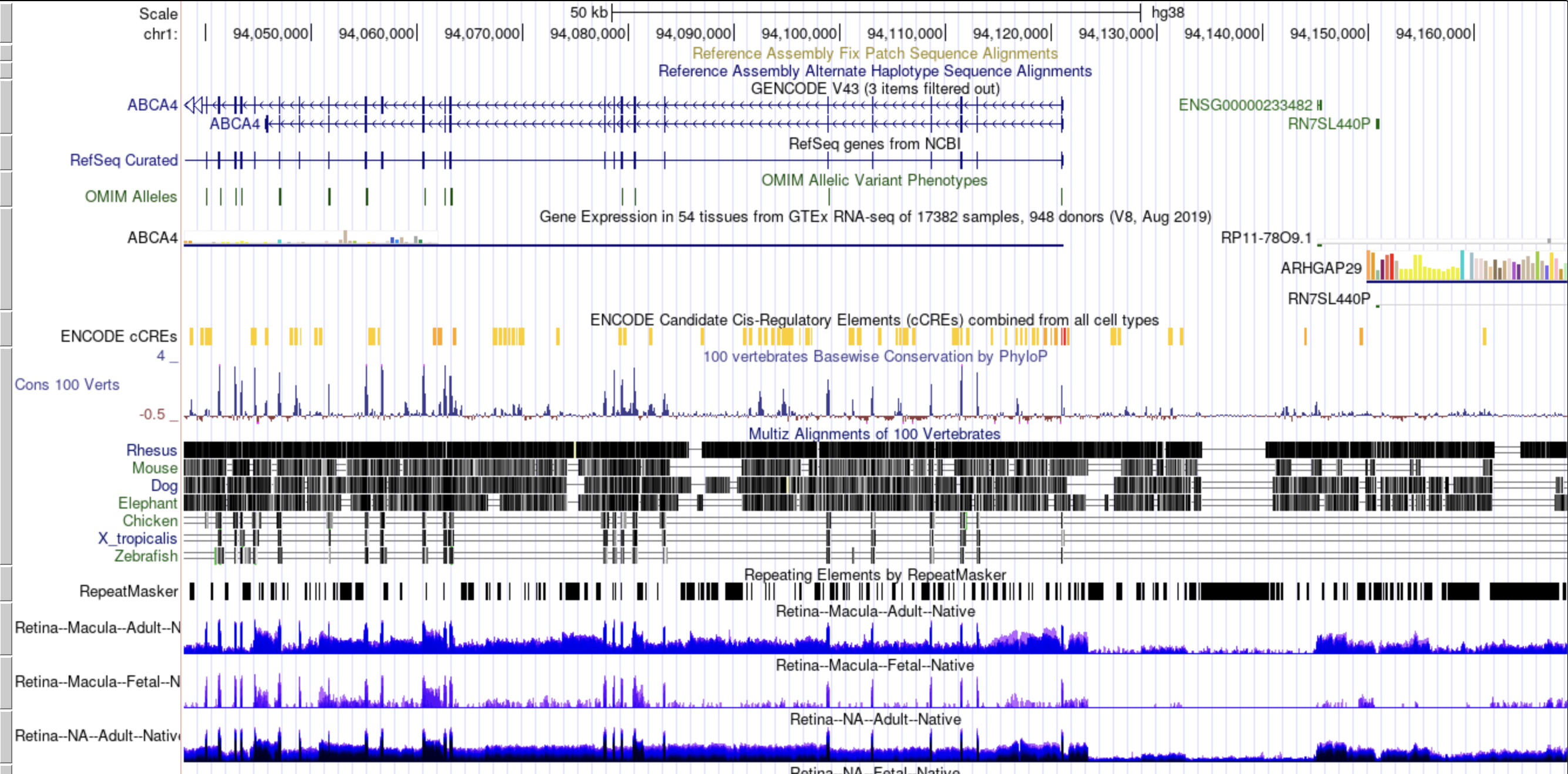
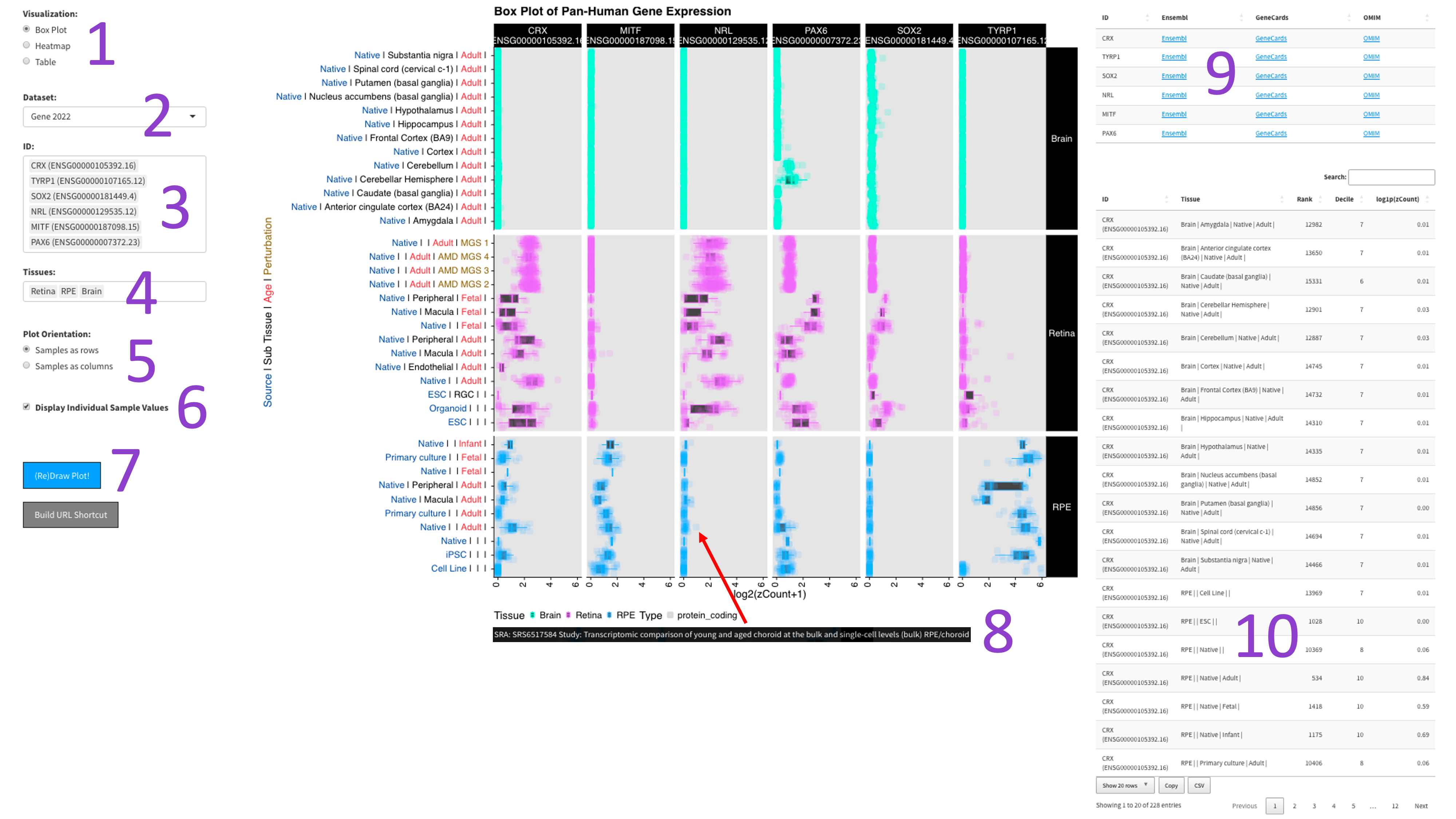
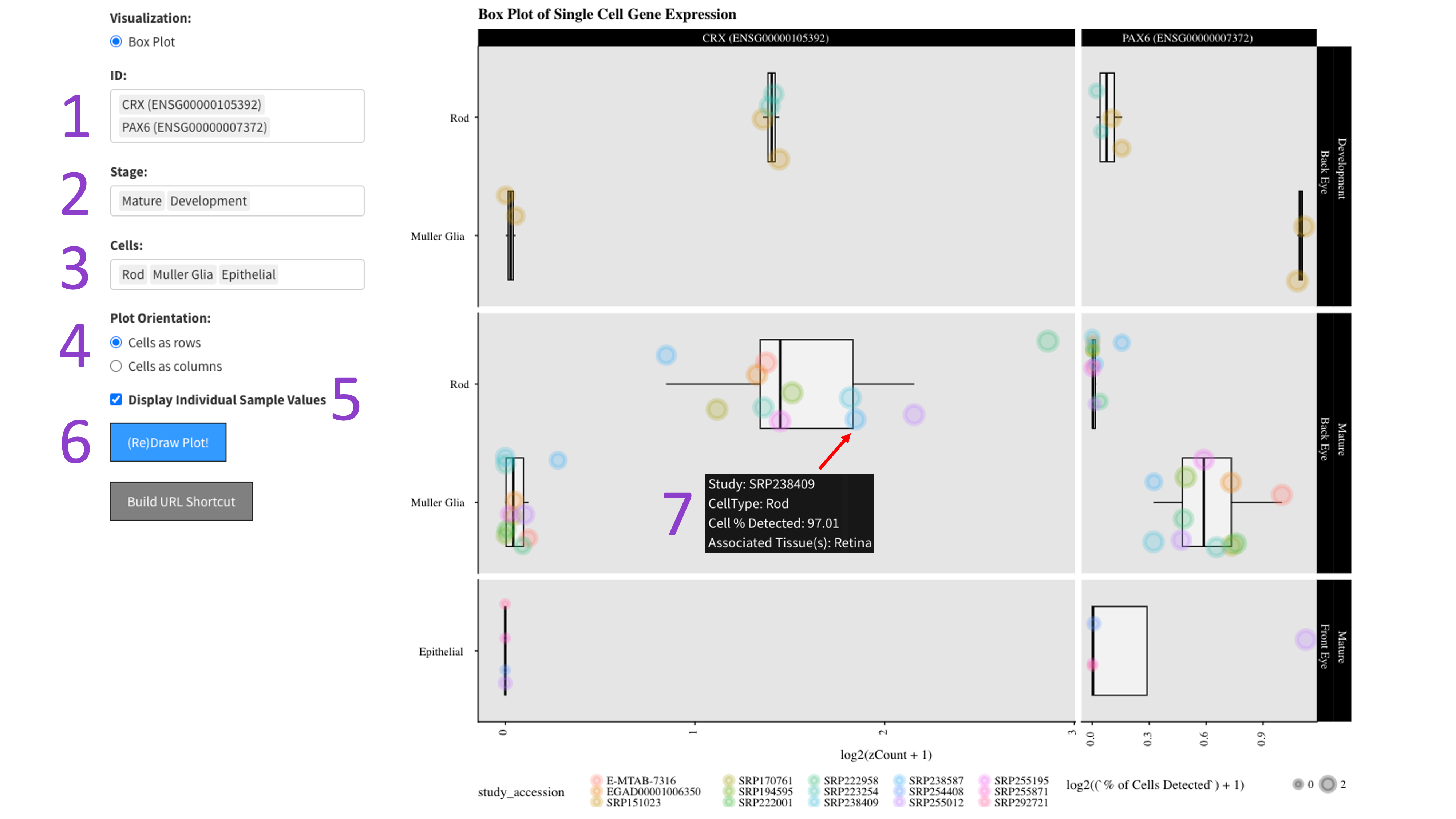
After selecting the 'Box Plot' radio button [1], you can choose a 2023 dataset [2].
Then, you can tweak which 'IDs' [3] and 'Tissues' [4] you would like to display by
clicking in the respective boxes and starting to type (allowed values will auto-fill).
You can also delete values by clicking on them and hitting the 'delete' key on your keyboard.
The display of the box plot can be changed depending on whether you want your samples to be
displayed as rows or columns [5]. Furthermore, the 'Display Individual Sample Values' checkbox [6]
will enable you to hover your mouse over a data point and show the metadata for that particular sample [8].
When you are done tweaking these parameters, you can click the big blue '(Re)Draw Plot!' button [7]
and wait a few seconds for the plot to appear.
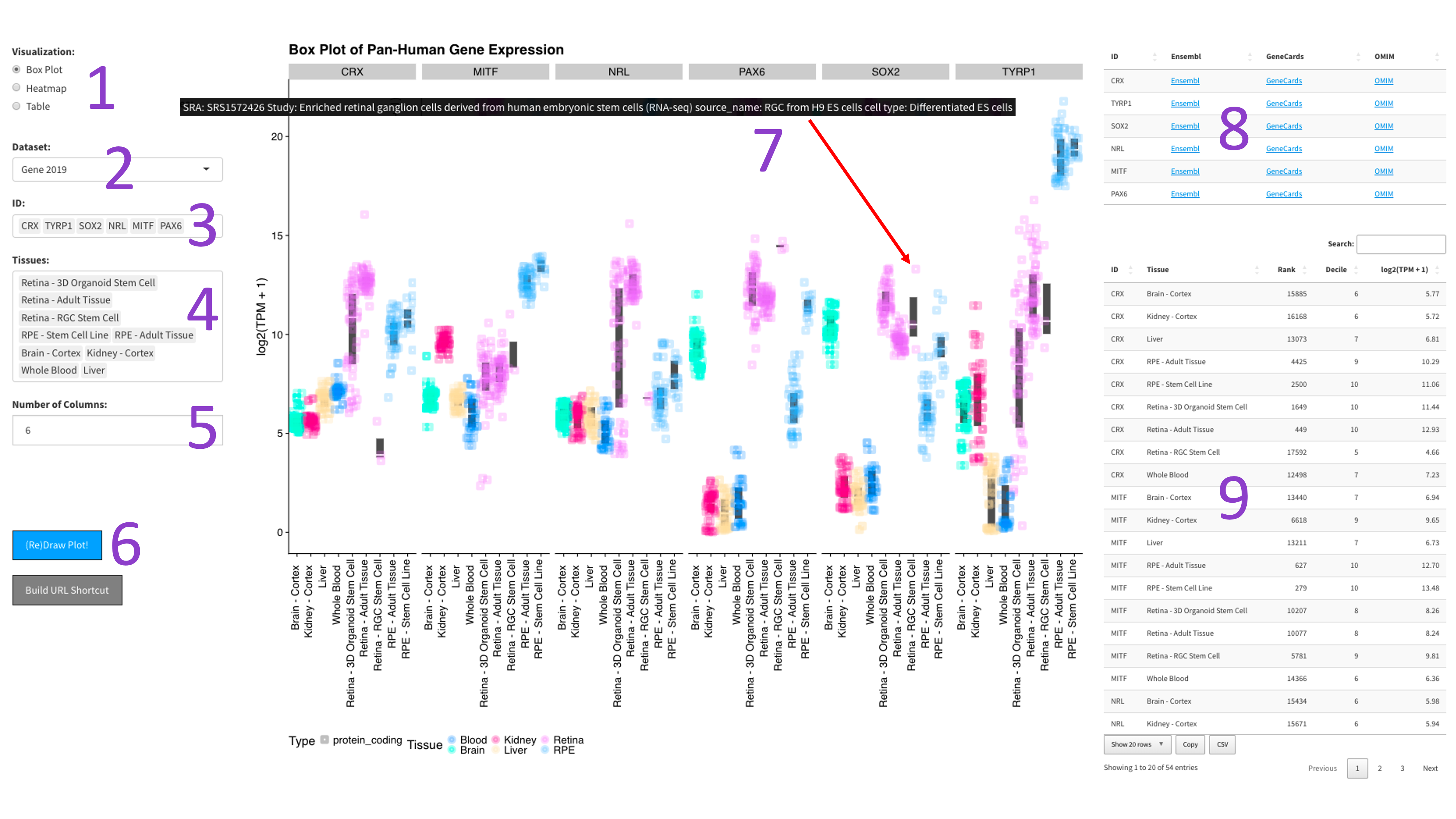
After selecting the ‘Box Plot' radio button [1], you can choose a 2017, 2019, or DNTx dataset [2].
Then, you can tweak which ‘IDs' [3] and ‘Tissues' [4] you would like to display by clicking in the
respective boxes and starting to type (allowed values will auto-fill). You can also delete values by
clicking on them and hitting the ‘delete' key on your keyboard. You can change the display of the box
plots by selecting a different value for the 'Number of Columns' field [5]. A lower number will squeeze
more plots in each column. When you are done tweaking these parameters, you can click the big blue
'(Re)Draw Plot!' button [6] and wait a few seconds for the plot to appear.
If you mouse over a data point, you will get metadata about that particular sample [7].
If you mouse over a data point, you will get metadata about that particular sample [7].
Each gene and tissue combination is given its own box. Depending on how the plot is oriented,
one axis is log1p transformed z-counts, and the other axis contains the samples, colored by tissue.
The right panel contains tables with external links to gene info [9], as well as the zCount values and
rank of each gene in the chosen tissues (lower is more highly expressed).
Each gene gets its own box. The y-axis is length scaled TPM (log2 transformed), and the x-axis is samples,
colored by tissue. The right panel contains tables with external links to gene info [8],
as well as the absolute TPM values and rank of each gene in the chosen tissues (lower is more highly expressed).
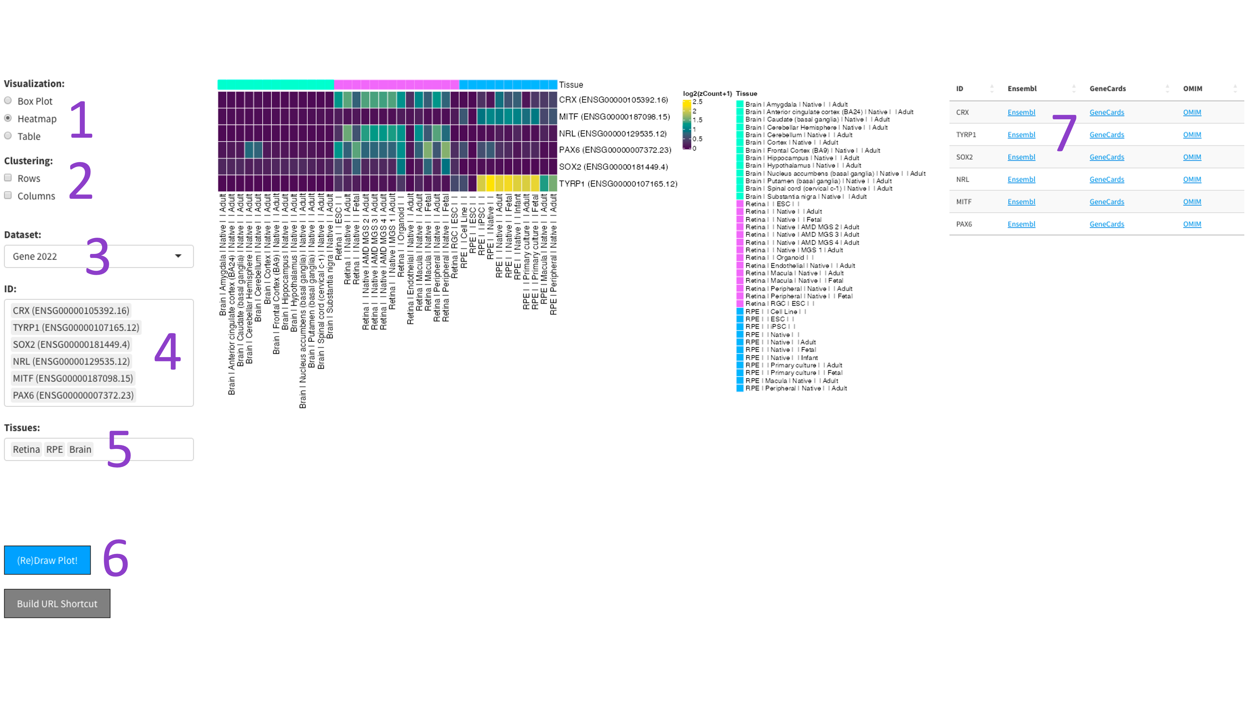
After selecting the ‘Heatmap’ radio button [1], you can choose a 2017, 2019, or DNTx dataset [3].
Then, you can tweak which ‘IDs’ [4] and ‘Tissues’ [5] you would like to display by clicking in the respective boxes
and starting to type (allowed values will auto-fill). You can also delete values by clicking on them and hitting the
‘delete’ key on your keyboard. The display of the heatmap can be changed depending on whether you want to cluster
your samples by rows or columns by clicking the appropriate checkboxes [2]. When you are done tweaking these parameters,
you can click the big blue '(Re)Draw Plot!' button [6] and wait a few seconds for the plot to appear
The heatmap is an efficient way to display the expression of many genes and tissues. More yellow indicates higher expression, and further information about each chosen gene can be found by following the external links in the table to the right [7].
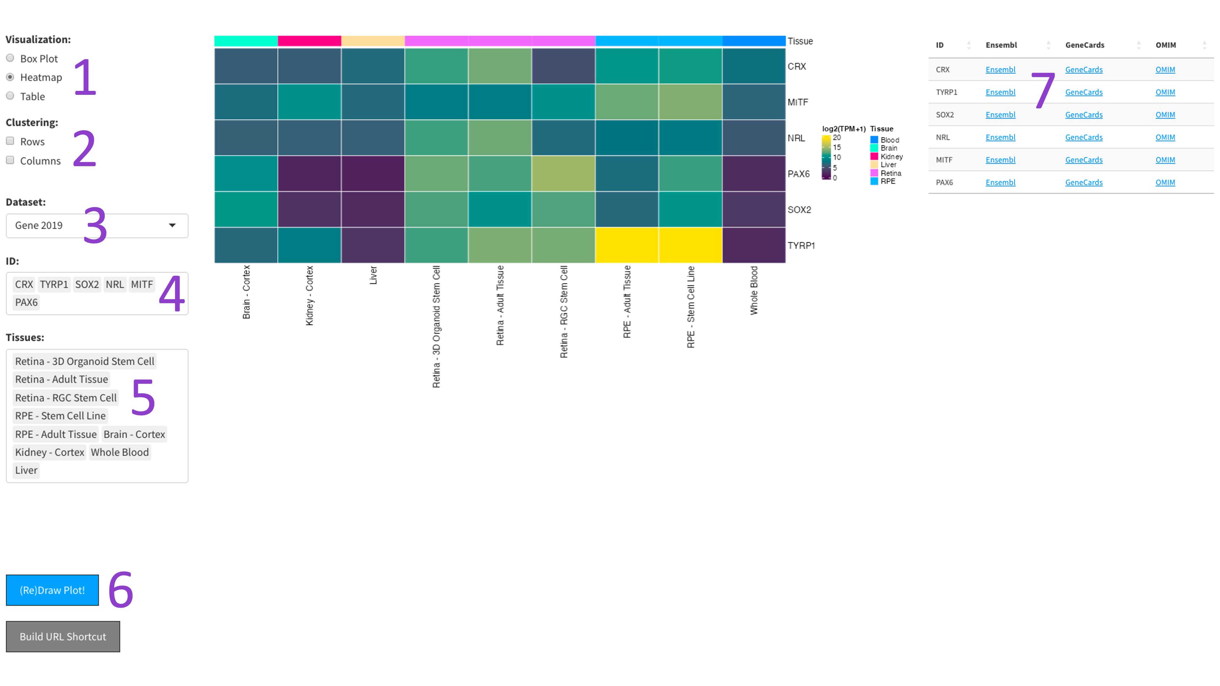
The heatmap is an efficient way to display the expression of many genes and tissues. More yellow indicates higher expression, and further information about each chosen gene can be found by following the external links in the table to the right [7].
The 2023 heatmap operates at the tissue level, which results in more samples being present.
This produces a table containing metadata for the gene and tissue combo selected by the user.
First you select the genes [1], stages of development [2], and cell types [3] you would like to view by clicking in their respective boxes
and starting to type (allowed values will auto-fill). You can delete values by clicking on them and hitting the 'delete' key on your keyboard.
Next, select whether you would like to view your cell types as rows or columns in the 'Plot Orientation' section [4].
Furthermore, the ‘Display Individual Sample Values’ checkbox [5] will enable you to hover your mouse over a data point and show the metadata
for that particular sample [7]. When you are done tweaking those parameters, click the big blue '(Re)Draw Plot!' button [6] and wait a few seconds.
Each gene and developmental stage combination gets its own box. These features are further faceted between the back and front of the eye.
Depending on how the plot is oriented, one axis is length scaled count value (log2 transformed), and the other axis contains the cell types.
If hover data is toggled on [5], then each point is colored by an independent study and the size of the point is a log2 scaled percentage of cells
that have detected expression of the gene.
This tool produces a plot of principal components from PCA (principal component analysis) conducted on our eyeIntegration 2.0 database.
To begin, the user must select the 'eyeIntegration PCA Plot' radio button [1]. Then, you can select and unselect various checkboxes to
include or exclude GTEx and single-cell RNA-seq data, as well as the visualization for which genes contribute most to your chosen principal
components of interest [2]. Once you have decided which data you would like to visualize, you can select two principal components to plot [3].
When you are done tweaking those parameters, click the big blue '(Re)Draw Plot!' button [4] and wait a few seconds for the plot to appear.
Since this plot was built using the ggplotly R package, you can hover your mouse over a point to see that sample’s metadata [6],
and adjust the plot window using various scaling parameters provided on the top right of the plot [7]. Tissue types can be included and excluded
by clicking directly on the name of the tissue within the legend on the right side of the plot [8].
Finally, if you would like to export the data used to make this plot, you can click the big blue 'Download Plot Data' button and download a CSV
containing the data [5].

This tool produces a plot of principal components from PCA (principal component analysis) conducted on our eyeIntegration 2.0 database and
projects user-inputted data onto this PCA space. To begin, the user must select the 'Project Your Data on PCA' radio button [1].
Then, you can select and unselect checkboxes to include or exclude GTEx and single-cell RNA-seq data from eyeIntegration [2].
Once you have decided which samples you would like to include in visualization, you can click the ‘Browse…’ button and search your computer
for a dataset to upload for projection [3]. This data should be in one of the following formats: csv, tsv, csv.gz, or tsv.gz.
In this tool, the projected data can be either faceted against, or overlayed onto the existing eyeIntegration database.
This can be selected from the dropdown menu under, ‘How Would You Like to Display Your Data?’ [4].
Finally, you can type in a name for your dataset to be included within the visualization [5], then select which principal components to plot [6].
When you are done tweaking those parameters, click the big blue '(Re)Draw Plot!' button [7] and wait a few seconds for the plot to appear.
Since this plot was built using the ggplotly R package, you can hover your mouse over a point to see that sample’s metadata [9],
and adjust the plot window using various scaling parameters provided on the top right of the plot [10]. Tissue types can be included and excluded
by clicking directly on the name of the tissue within the legend on the right side of the plot [11].
Finally, if you would like to export the data used to make this plot, you can click the big blue 'Download Plot Data' button and download a CSV
containing the data [8]. This data will include a scaled version of the original user data to plot alongside the eyeIntegration 2023 dataset.
Faceted View

Overlayed View

Faceted View
Overlayed View
The data table shows, for each gene and tissue set the user selects, the most important metadata for each sample.
These are all features from the 2019 iteration of eyeIntegration which have either been replaced with new features or deprecated due to limited use.
This is short for differential expression. We have pre-calculated 55+ differential expression tests. All eye tissue - origin pairs were compared to each other. We also have a synthetic human body set, made up of equal numbers of GTEx tissues (see manuscript, above, for more details). The word cloud displayed shows as many as the top 75 terms used in enriched GO terms in the selected comparison. The table data shows the actual GO terms. You can search for the comparison of your choice.
These are the values taken from the limma differential expression topTable() summary table. The following has been taken from the limma manual and edited to match parameters we used (https://www.bioconductor.org/packages/devel/bioc/vignettes/limma/inst/doc/usersguide.pdf):
A number of summary statistics are presented by topTable() for the top genes and the selected contrast. The logFC column gives the value of the contrast. Usually this represents a log2-fold change between two or more experimental conditions although sometimes it represents a log2-expression level. The AveExpr column gives the average log2-expression level for that gene across all the arrays and channels in the experiment. Column t is the moderated t-statistic. Column P.Value is the associated p-value and adj.P.Value is the p-value adjusted for multiple testing (False Discovery Rate corrected).
The B-statistic (lods or B) is the log-odds that the gene is differentially expressed. Suppose for example that B = 1.5. The odds of differential expression is exp(1.5)=4.48, i.e, about four and a half to one. The probability that the gene is differentially expressed is 4.48/(1+4.48)=0.82, i.e., the probability is about 82% that this gene is differentially expressed. A B-statistic of zero corresponds to a 50-50 chance that the gene is differentially expressed. The B-statistic is automatically adjusted for multiple testing by assuming that 1% of the genes, or some other percentage specified by the user in the call to eBayes(), are expected to be differentially expressed. The p-values and B-statistics will normally rank genes in the same order. In fact, if the data contains no missing values or quality weights, then the order will be precisely the same.
The Macosko data is a single-cell (~45,000) retina RNA-seq mouse P14 C57BL/6 dataset from Mackosko and McCarroll's field defining
paper.
The cluster / cell type assignments are taken from
here.
The Clark data is a 100,000 cell plus mouse retina RNA-seq time series dataset. Their pre-publication manuscript is on
bioRxiv.
Data was pulled from
here.
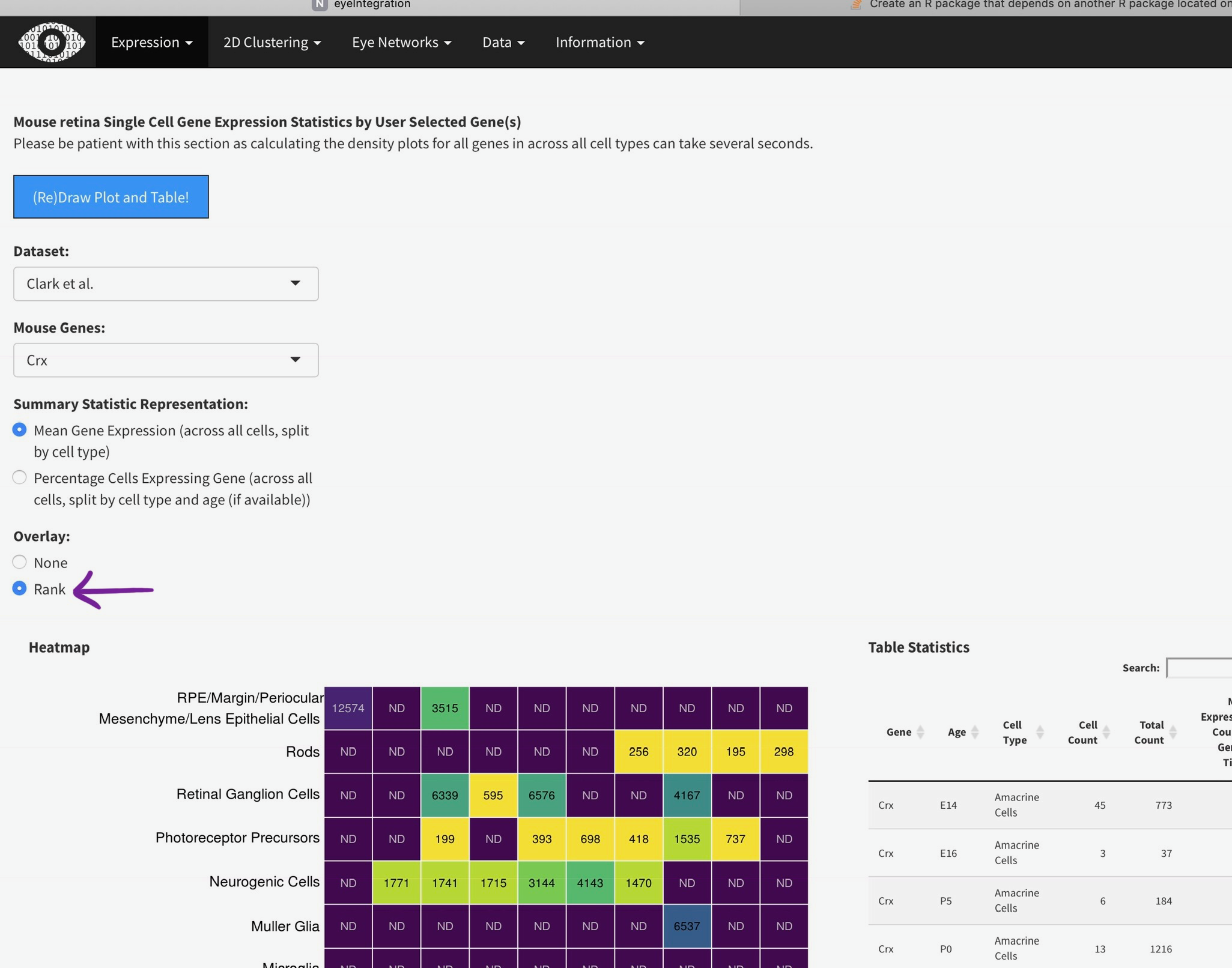
To efficiently display a huge amount of information, expression across many individual cells is averaged by cell type, (if available) age, and gene. You can select the Macosko or Clark dataset [1], then one gene [2] to plot. The gene expression is displayed as a heatmap, with each row being a retina cell type (derived by the respective authors) and each column [4] is a time point, arranged from youngest to oldest. More yellow is higher expression [5].
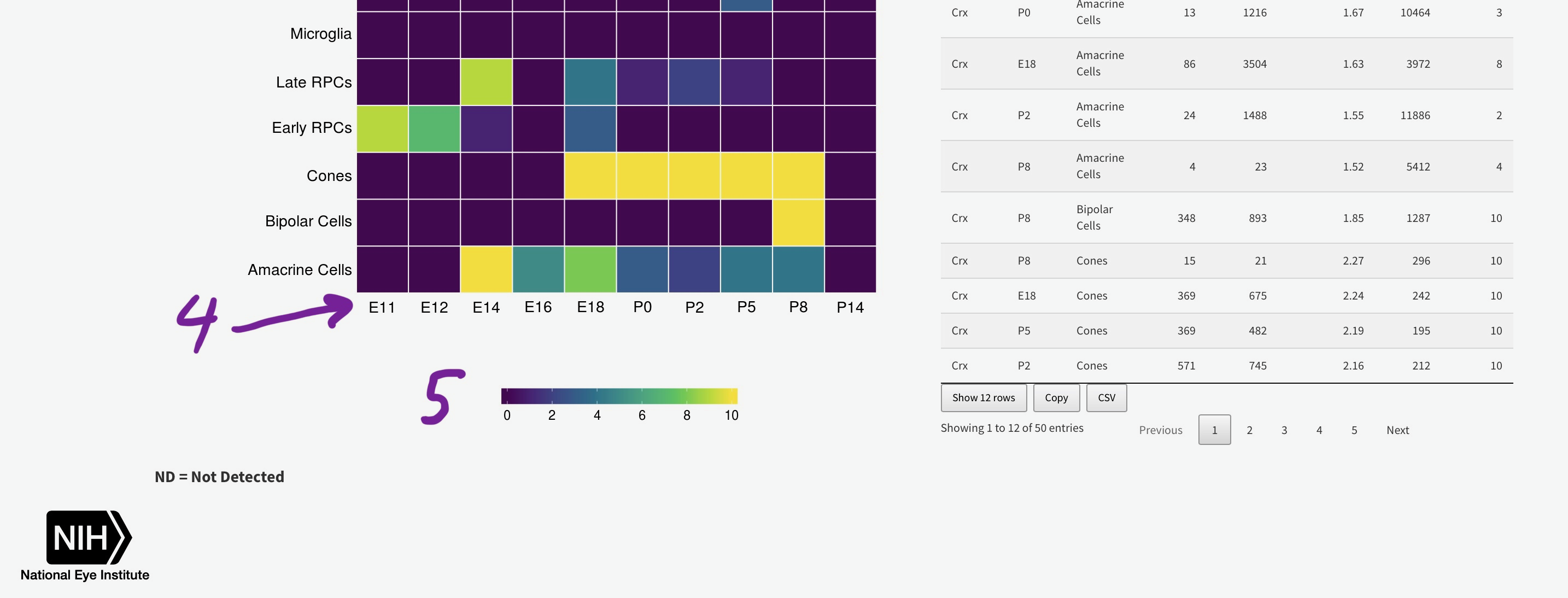
You can add the rank of expression (or rank of percentage of cells with detectable expression of selected gene) with this radio
This data table set shows the data used to make the Mouse Single Cell Retina Expression plots in Gene Expression.
This shows the t-SNE tissue clustering for the bulk human eye tissues along with the GTEx data-set. Hovering the mouse over each data point will show the metadata. Changing the perplexity will demonstrate how low values artificially create sub-groups while higher value (above 30 or so) largely recapitulate tissue type. It also demonstrates that the tissue clustering is stable at higher perplexities.
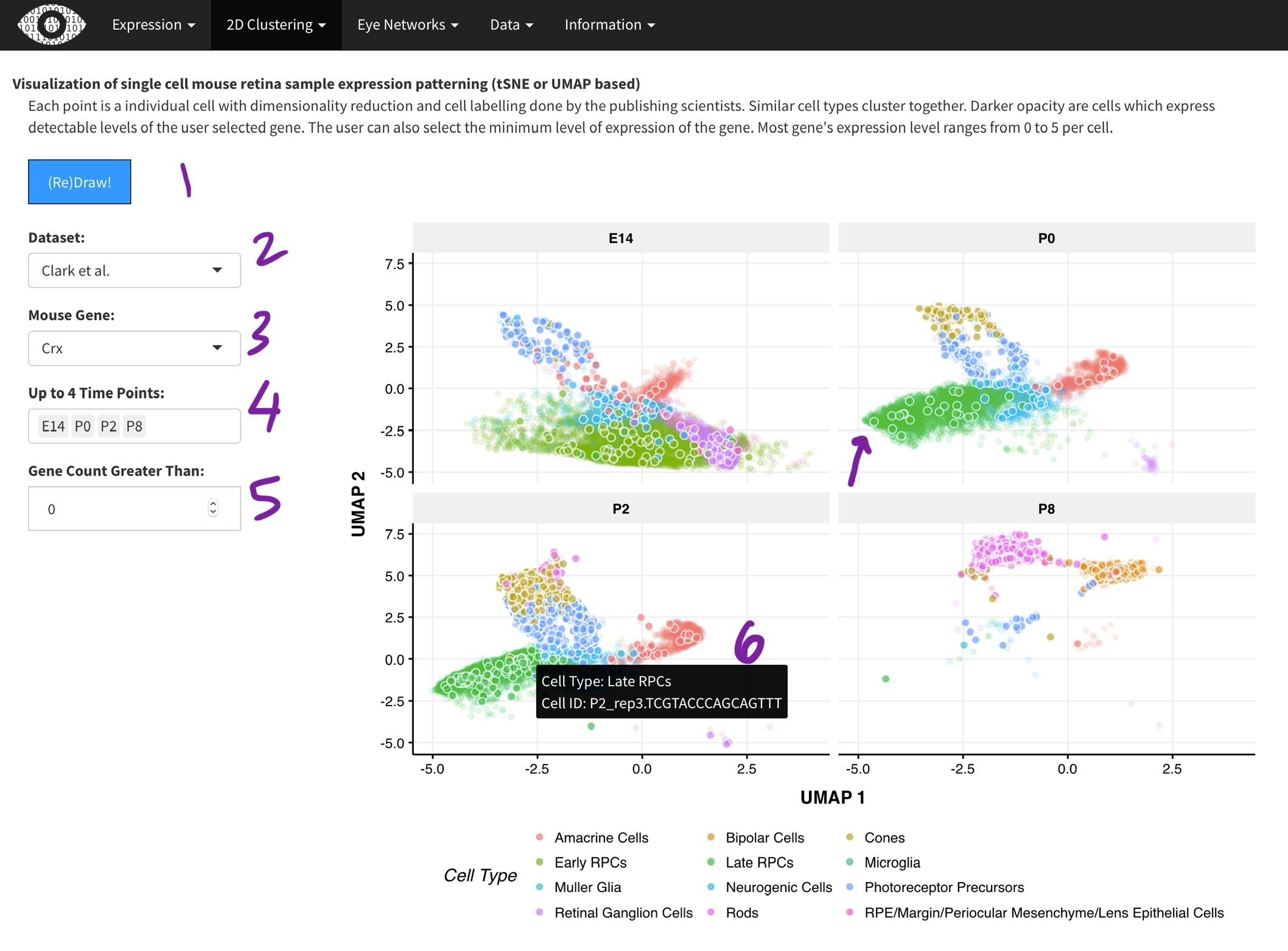
Each data point is a single cell from the
Macosko and McCarroll
or the
Clark and Blackshaw
[2]. Dimensionality reduction with done with the t-SNE (Macosko) or UMAP (Clark) algorithm. Cluster assignments were taken from the respective papers. While we did the t-SNE on the Macosko data, the Clark authors provided the UMAP coordinates. The Clark dataset was generated across multiple time-points during development and thus, you can select time points of interest [4]. Only one gene can selected at a time [3], as it is very computationally expensive to plot many points. Points (cells) expressing the gene of interest are plotted in darker color [arrow]. Hovering over each point [6] will show the metadata for the cell.
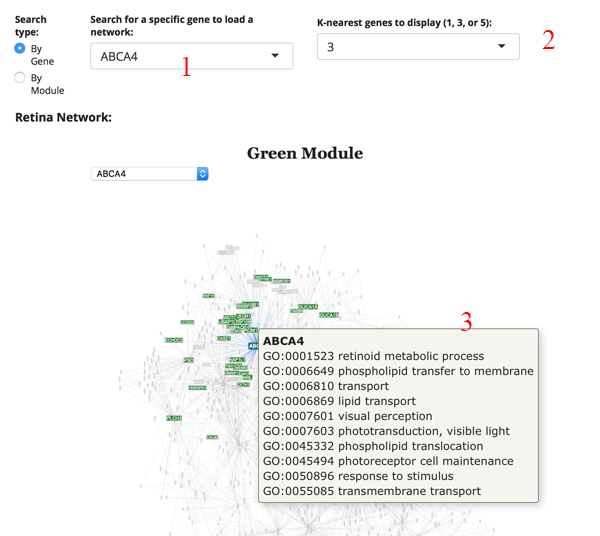
This is a weighted gene expression correlation network. The gene expression information for all retina or all RPE tissues is used to identify gene pairs whose expression is correlated with each other. All of the pair-wise correlations are assessed to build a network of interactions.
We imagine the most common use is to search for your gene of interest (GOI). Simply type your GOI into the search box [1]. If it is not in the network, then the name will not appear. After selecting the GOI, the network will reload to display the module the gene is in, as well as several of the most correlated partners. You can adjust the number of displayed correlated genes by changing the K-nearest genes panel [2]. Hovering over a gene name in the network will display GO terms for the gene [3].
Unfortunately, we have no way of knowing this. Since the network algorithms use correlations, the gene to gene interactions have no directional information.
The count plot [1] simply shows the number of genes in each module. A gene can only be in one module. The pair-wise gene connection strength [2] shows the strongest gene partners for the selected gene. If a module search is selected, then this table shows all gene to gene edge connection strengths (higher is stronger) in the module. The gene connectivity table [3] shows the kWithin metric for each gene in the module, which denotes how connected (and important) the gene is across the module. The GO term table [4] shows the significant GO terms for the genes in the module. This allows you to get a sense of the function of the module.
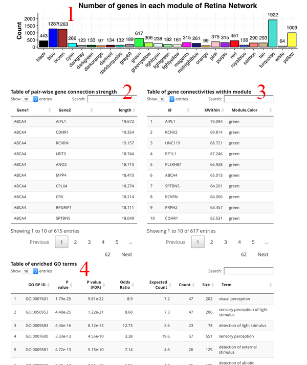
The edge table allows you to search for a gene and it returns all significant (edge length > 0.01) correlated genes ACROSS the entire network. Using the 'Connections to show' radio button, you can control whether only extramodular or intramodular (or both) connections are included in the table.
Word Clouds of most common enriched GO terms
GO Term Enrichment
Heatmap of developing retina. Rows are genes, columns are age (in days) of retina or organoid.
Gene Expression Levels across Developing Fetal and Organoid Retina (days)
Mouse retina Single Cell Gene Expression Statistics by User Selected Gene(s)
Please be patient with this section as calculating the density plots for all genes in across all cell types can take several seconds.
Heatmap
Table Statistics
ND = Not Detected
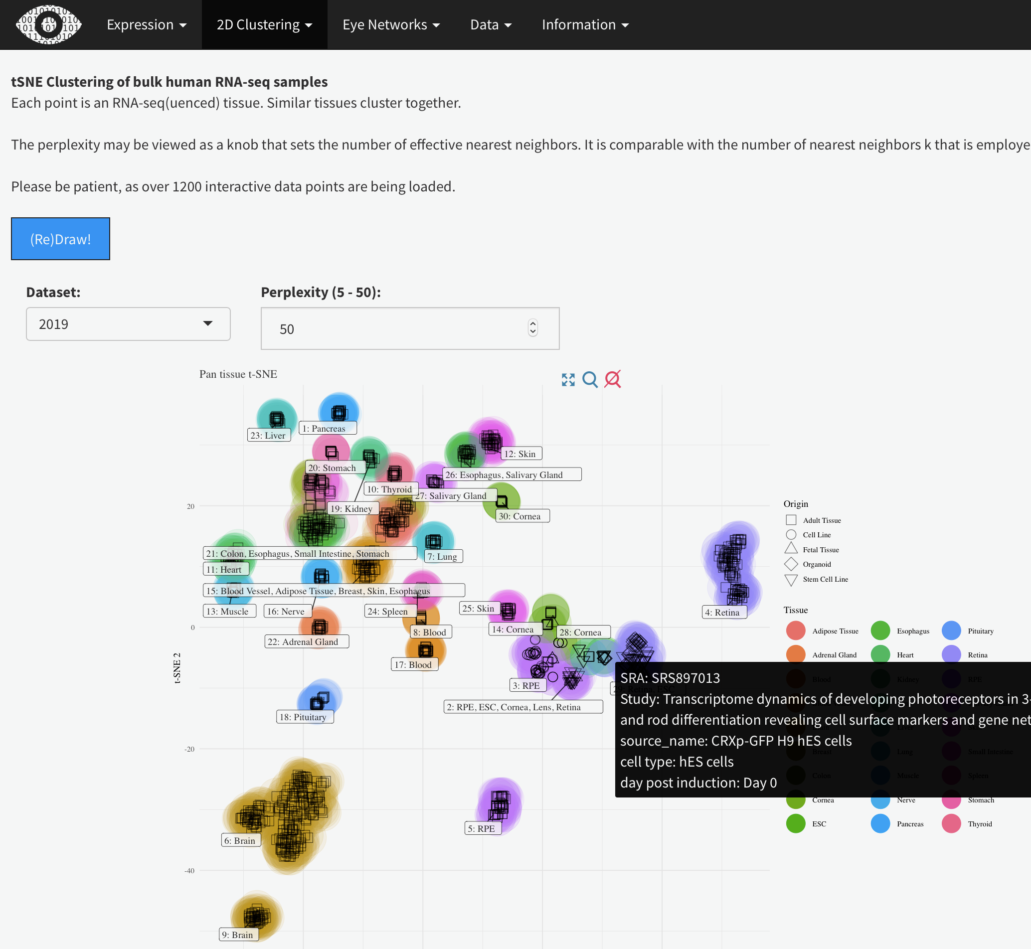
tSNE Clustering of bulk human RNA-seq samples
Each point is an RNA-seq(uenced) tissue. Similar tissues cluster together.
The perplexity may be viewed as a knob that sets the number of effective nearest neighbors. It is comparable with the number of nearest neighbors k that is employed in many manifold learners.
Please be patient, as over 1200 interactive data points are being loaded.
Visualization of single cell mouse retina sample expression patterning (tSNE or UMAP based)
Each point is a individual cell with dimensionality reduction and cell labelling done by the publishing scientists. Similar cell types cluster together. Darker opacity are cells which express detectable levels of the user selected gene. The user can also select the minimum level of expression of the gene. Most gene's expression level ranges from 0 to 5 per cell.
Retina Network:

Table of pair-wise gene connection strength
Table of pair-wise gene connection strength
Table of gene connectivities within module
Table of gene connectivities within module
Table of enriched GO terms
Table of enriched GO terms
RPE Network

Table of pair-wise gene connection strength
Table of pair-wise gene connection strength
Table of gene connectivities within module
Table of gene connectivities within module
Table of enriched GO terms
Table of enriched GO terms